In spring of 2018, I enrolled in the User Experience Design course at General Assembly Washington DC to get certified and be able to validate my learnings. Our first project was a open based project – we were asked to talk to a friend/classmate about their real-life problems and create a web/mobile app-based solution. It encouraged me to think big and have fun but also taught me how to narrow down to a realistic project scope for a three-week sprint.
Using my learnings of the Double Diamond into this project I structured it into four phases: Discover, Define, Develop, and Deliver.
User Research, User Interviews, Surveys, Persona Creation, User Journey Mapping, Information Architecture, User App Flow and Sitemap, Wireframes and Prototyping, and User Testing
Having dietary restrictions has always made eating out a big challenge. Being a vegetarian, I have faced several stressful dining experiences. When I have ordered food and it didn’t come out the right way and I would have to send it back and wait another 20-30 mins for the food to be made right.
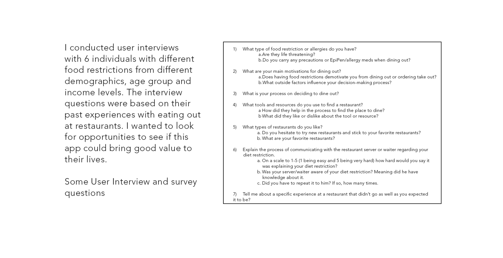
And while interviewing users with severe allergies their experiences were even worse where they have had allergic reactions even after mentioning abt it to the restaurant staff.
According to FARE - Food Allergy Research Education 15 million Americans have food allergies, including 5.9 million children under age 18. 7.3 million people, follow a vegetarian-based diet and approximately 0.5 percent, or 1 million, of those are vegans, who consume no animal products at all
So I decided to address this problem and I tried to look for some facts. Even though there were so many people with food restrictions they still struggle to find the right restaurants to fit their needs. Having food restrictions may impact how frequently you eat out, where you eat out, and how you prepare for such occasions. Even more than that, dietary restrictions can have social and emotional impacts. Negative encounters occur all too frequently and can leave you feeling alienated, embarrassed, discouraged and dissatisfied, regardless of how the meal actually tasted.
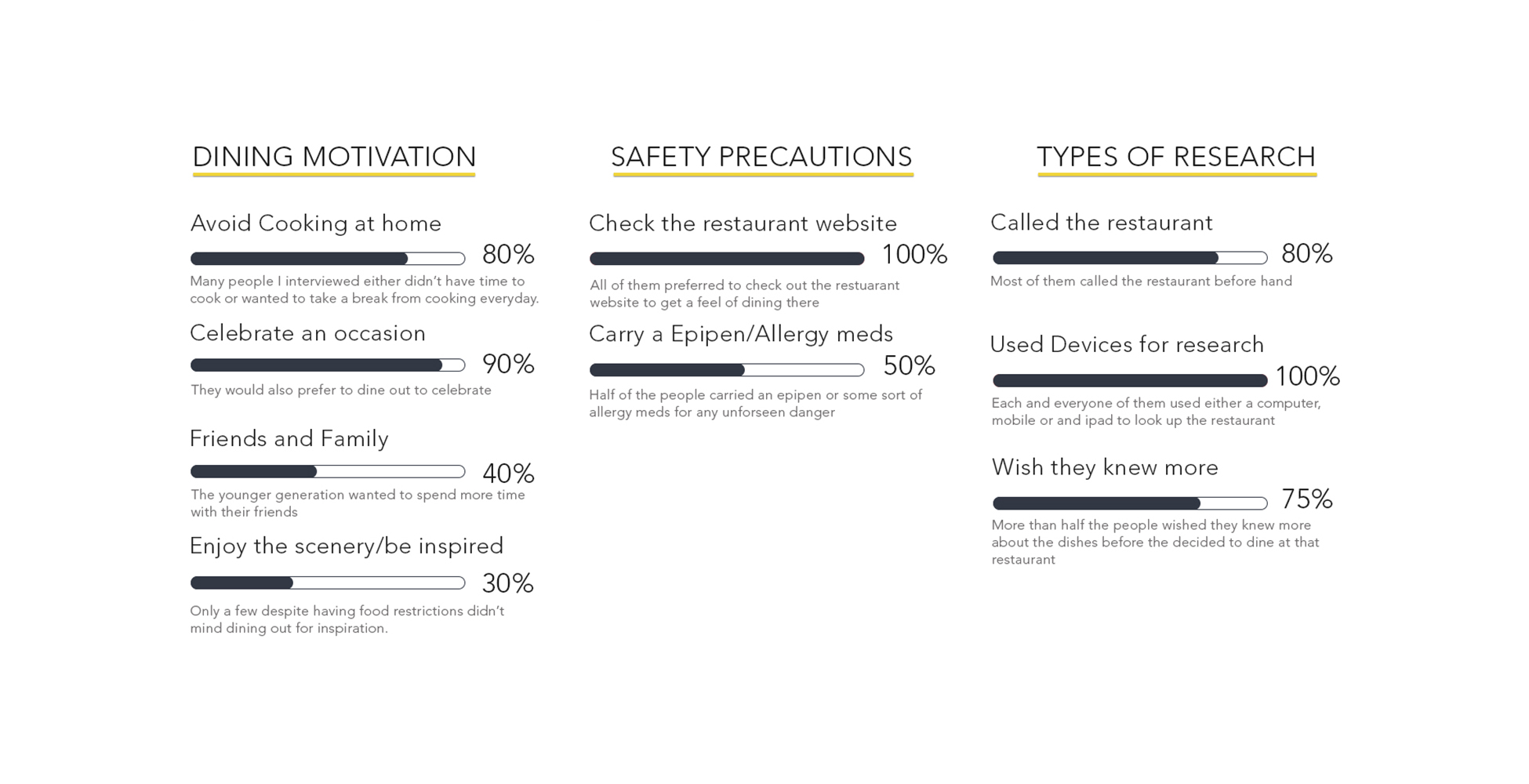
Based on my user interviews, it became clear that the existing solutions lack the ability to compare restaurants according to their custom diet profile, create a custom menu and to successfully communicate to the restaurant staff.
So the idea is to allow users to streamline their search process under one platform allowing the users to create a categorized search, compare and reserve a table and communicate with the restaurant easily.
An app that will help people with food restrictions to find and communicate with restaurants about their diet restrictions and ensure they have a safe and enjoyable experience eating out. The app will make food safety information convenient to obtain which will bring great value to users in their process.
Defining my process was important before even I started to dive into the features and the overall User experience of the product.

“Dining out is supposed to be fun, but for people like me with allergies, the experience ends up being stressful instead.”
“I always carry an epipen with me when I dine out, you never know what ingredient they missed out to list on the menu.”
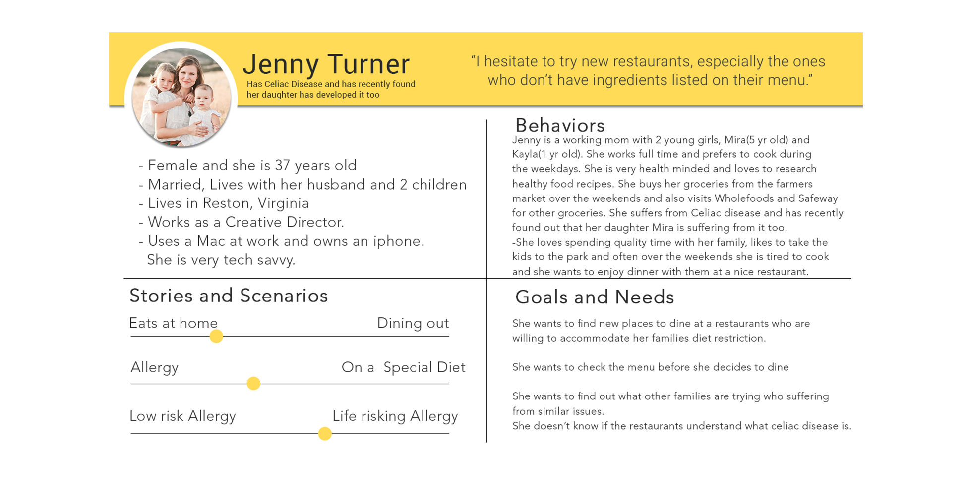
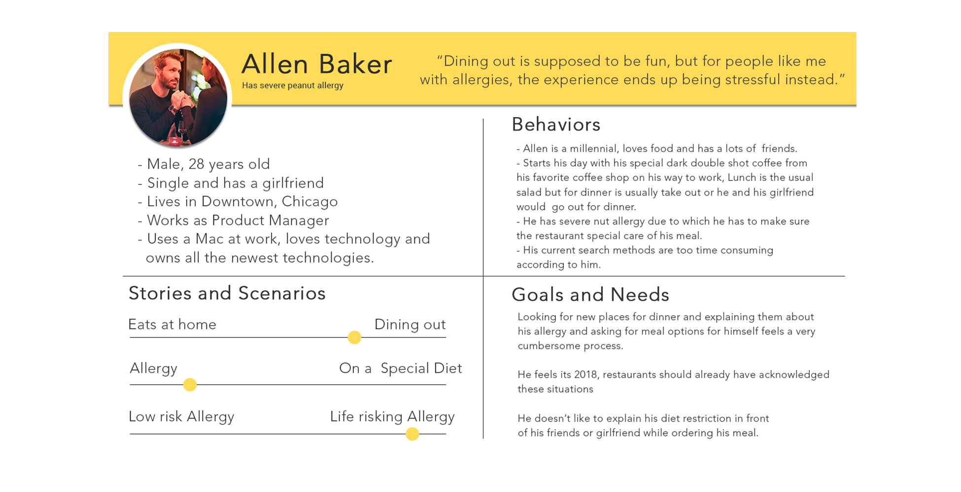
Having done my research, I had a pretty clear idea of the processes each of the personas go through their path to looking for the right restaurant and beyond. I tried to define the behavioral stages from the customers perspective by building a user journey map. I have organized the map by stages that reflect the major goals the user is trying to achieve, rather than organizing it by stages that reflect my own internal process. The map is created by keeping in mind what the user is trying to achieve at very step, and using the data I collected via user interviews to represent it.
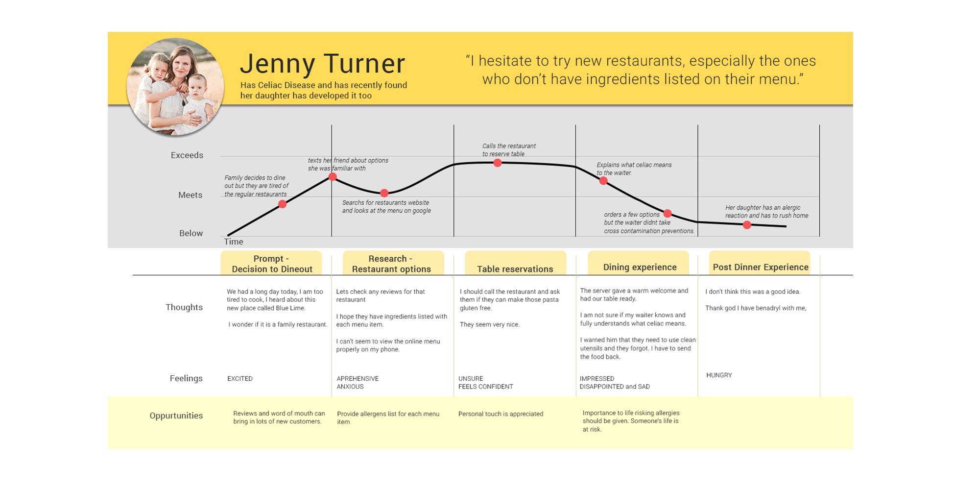
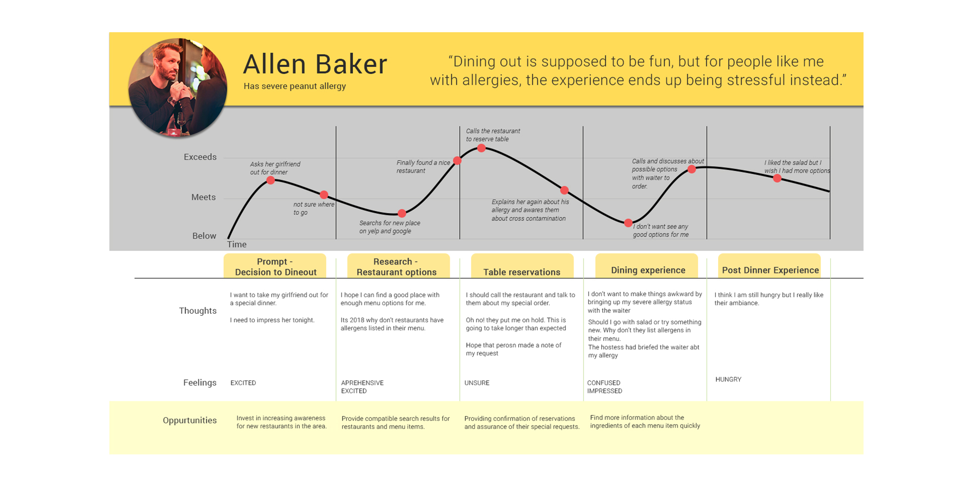
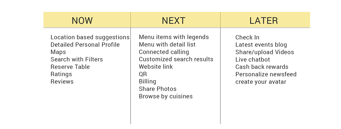
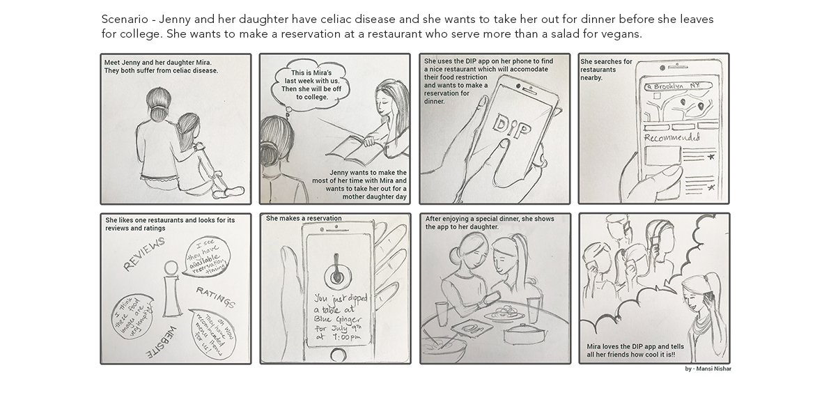
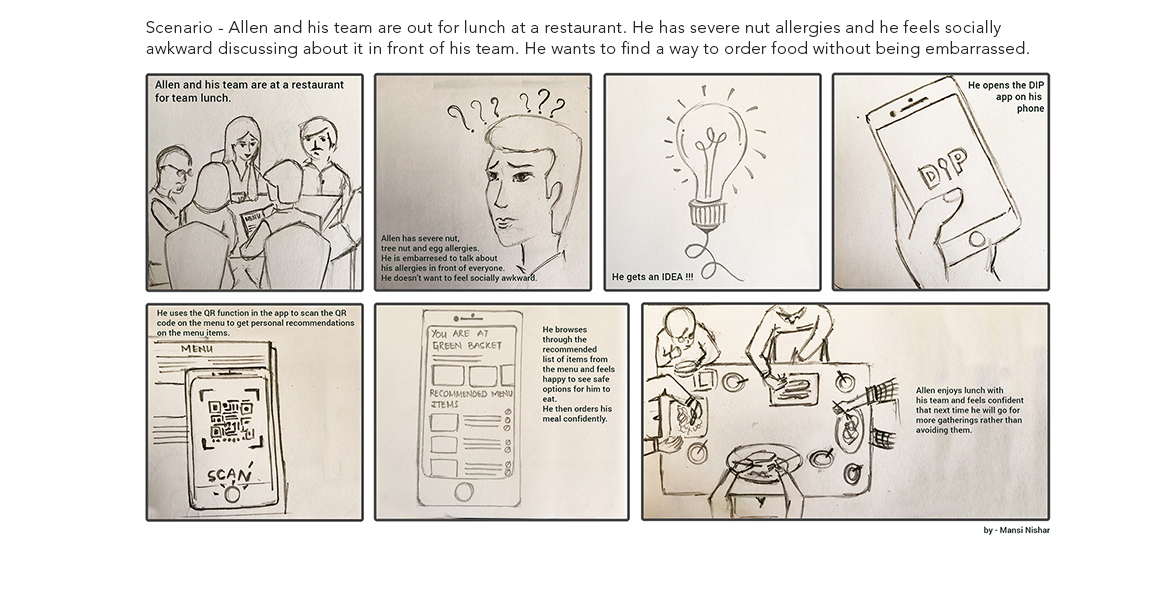
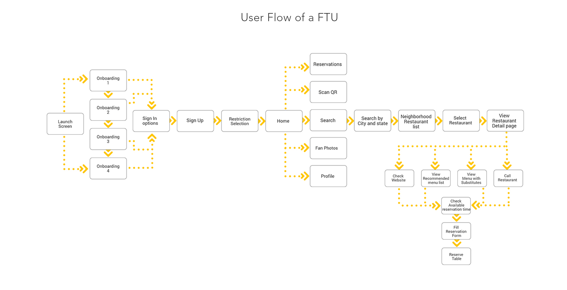
By analyzing Jenny’s journey I was then able to narrow down the features via card sorting for the vital features to complete a certain CTA. I then created a site map and user flow diagram to organize the pages, information, and navigation of the app.
This helped me in improving the user experience of the app. With a well-defined site flow, it is easy to identify areas for improvement, especially concerning navigation, but it also helped identify ideal locations for links or plan for the inclusion of microinteractions. Creating a user flow helped identify potential user behavior when completing website tasks so that developers can plan appropriately.
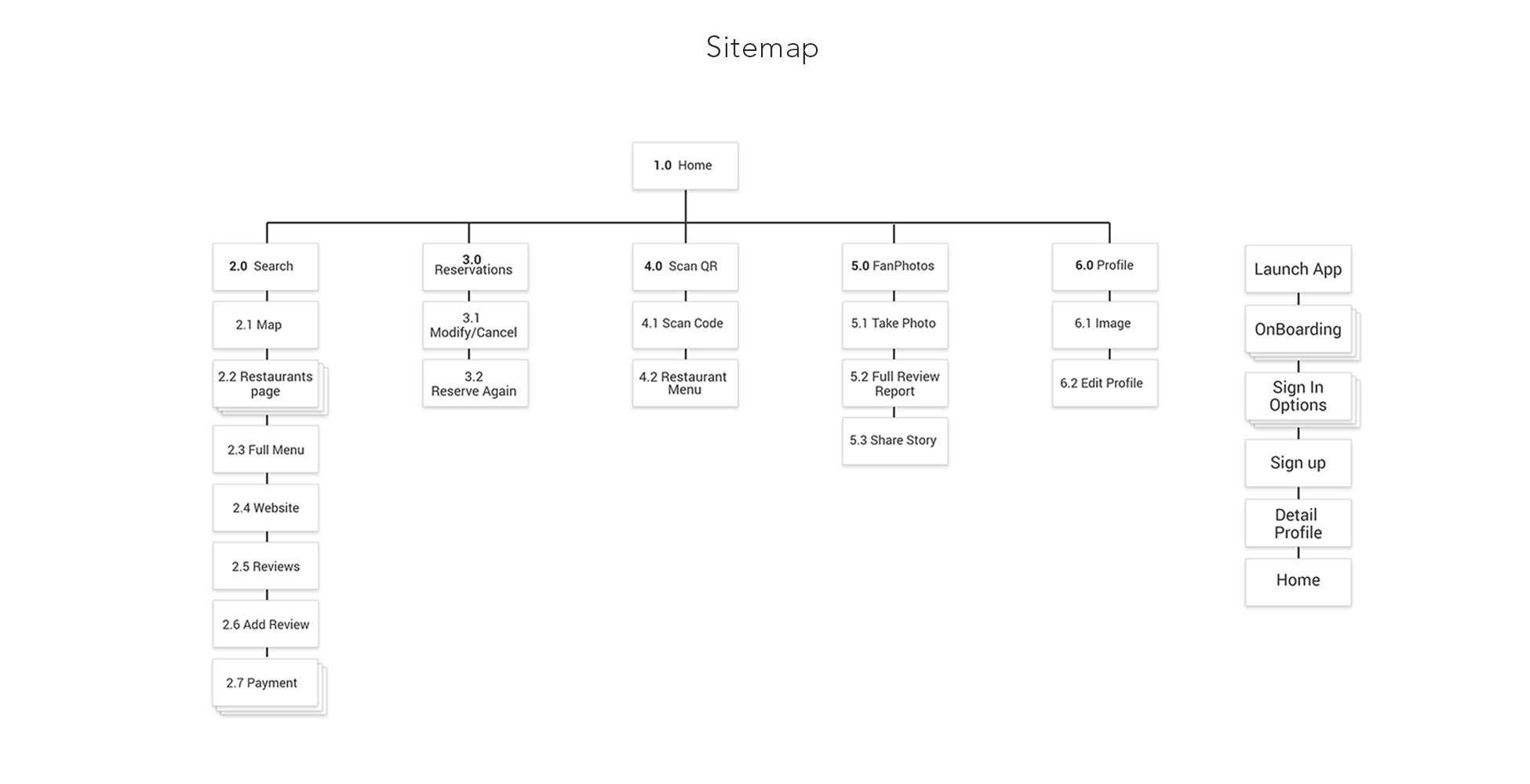
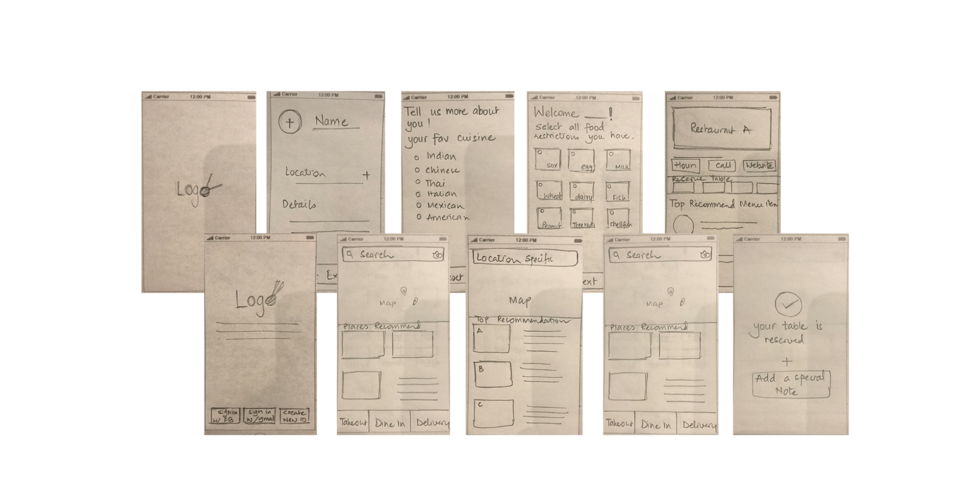
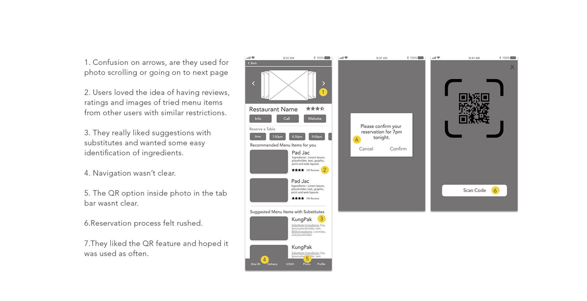
Now that I had a solid understanding of navigation patterns and number of screens, it was time to lay out some initial screens. Once I had them ready, with initial user testing I removed any visual clutter or interactional issues I discovered in the process. Then began the creative process of imagining how to arrange UI elements to allow users to navigate the app with engaging user experience.
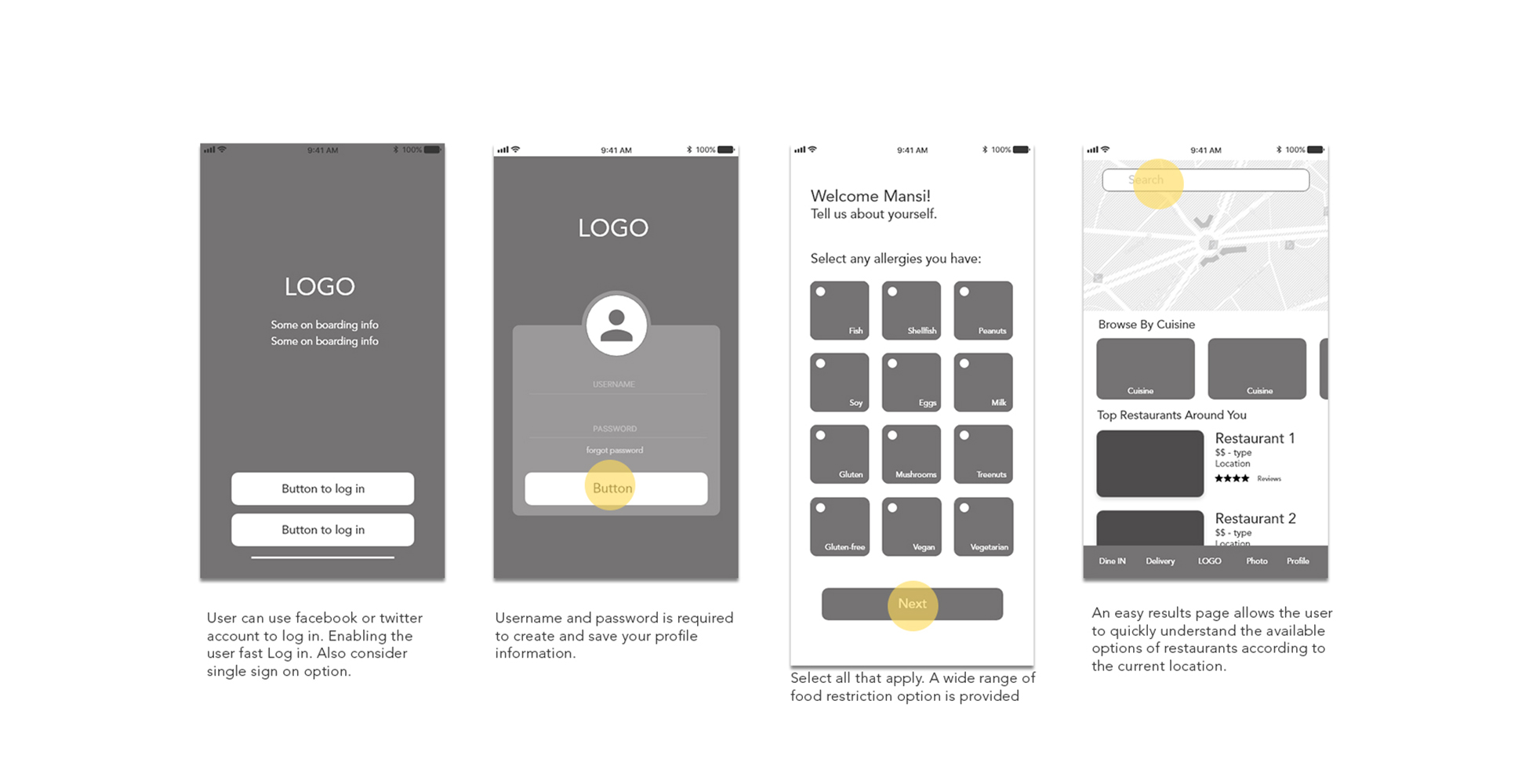
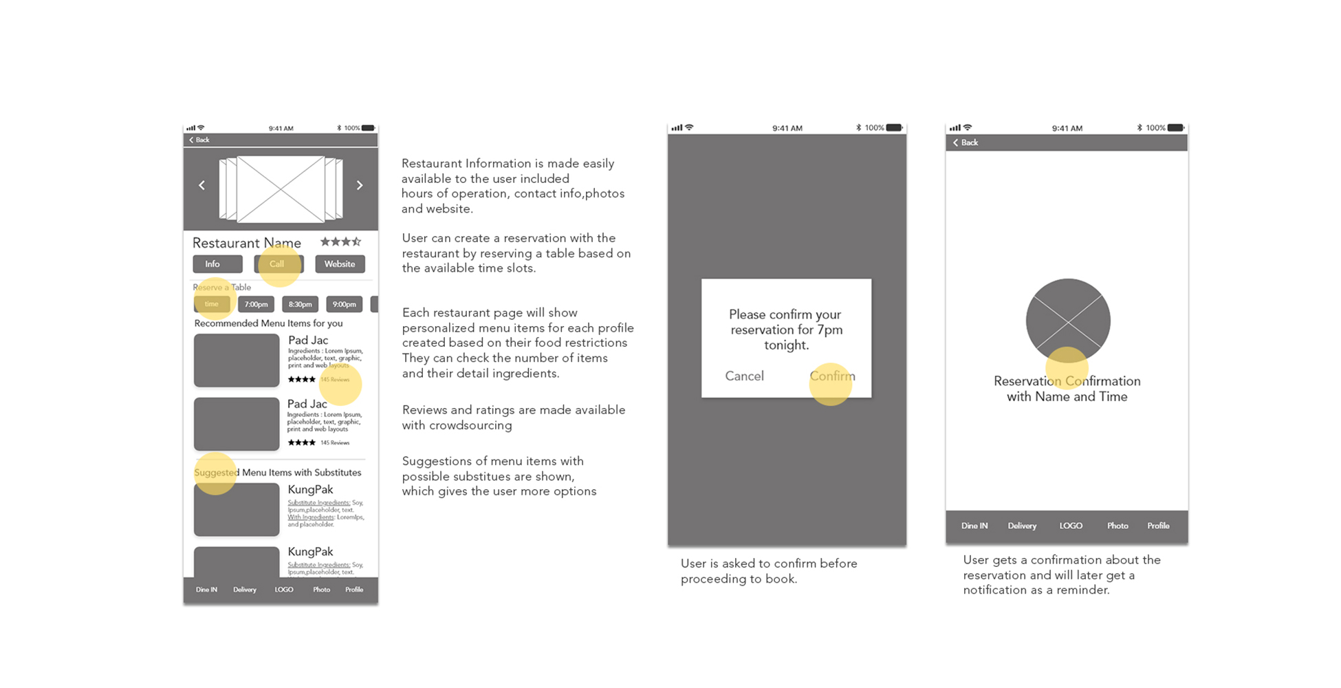
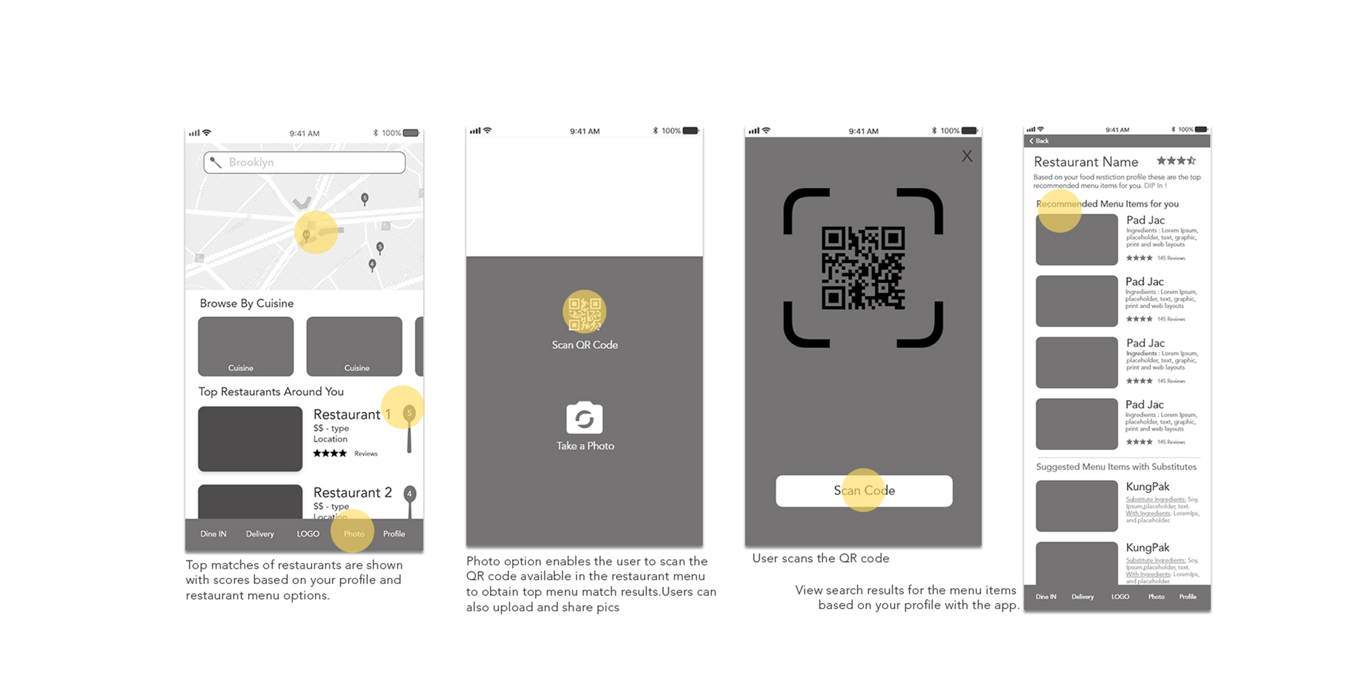
To optimize best user experience, I did user testing on a workable hi-fidelity prototype. The testing research goals were based on:
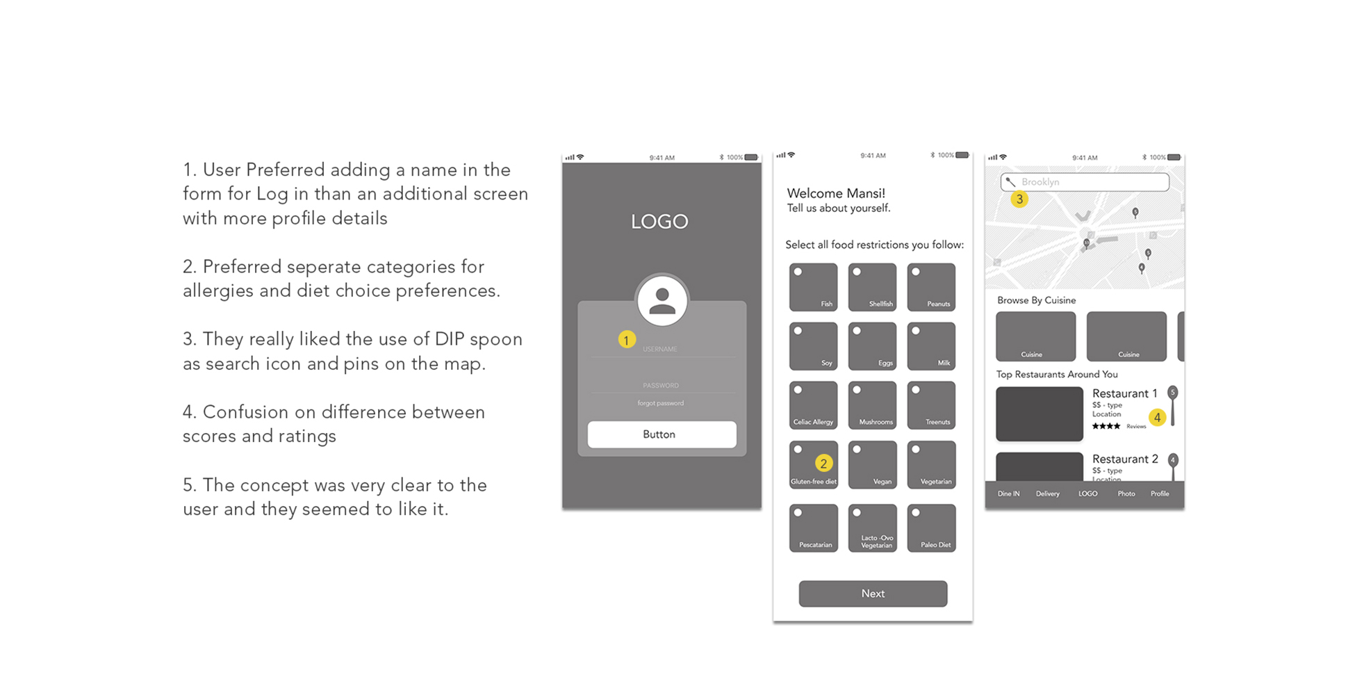
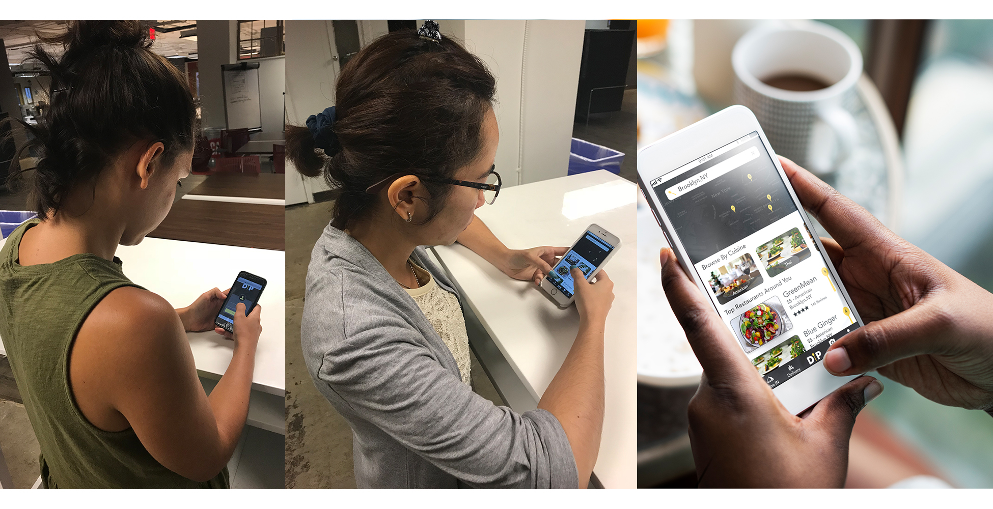
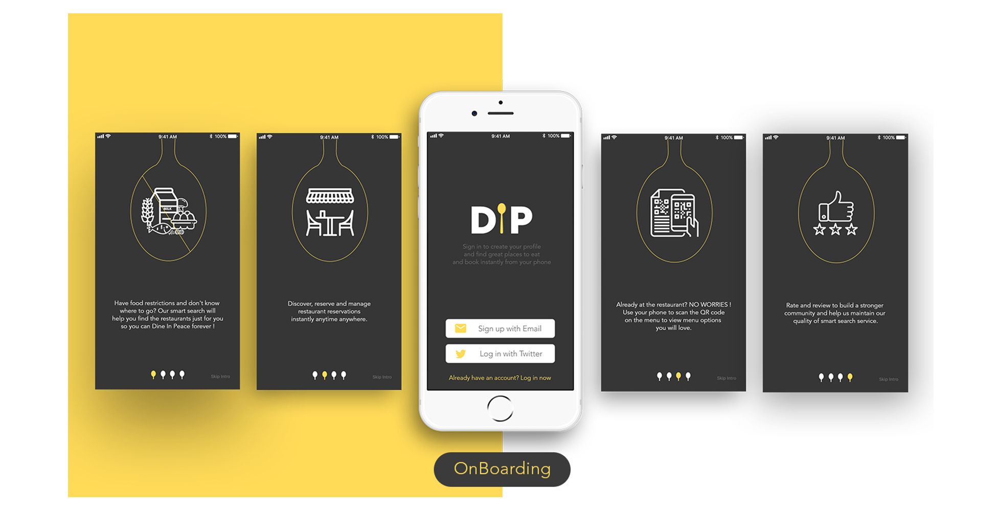
This is one of my favorite steps in UX, when all your hard work comes to life before commencing into development, in a working prototype.
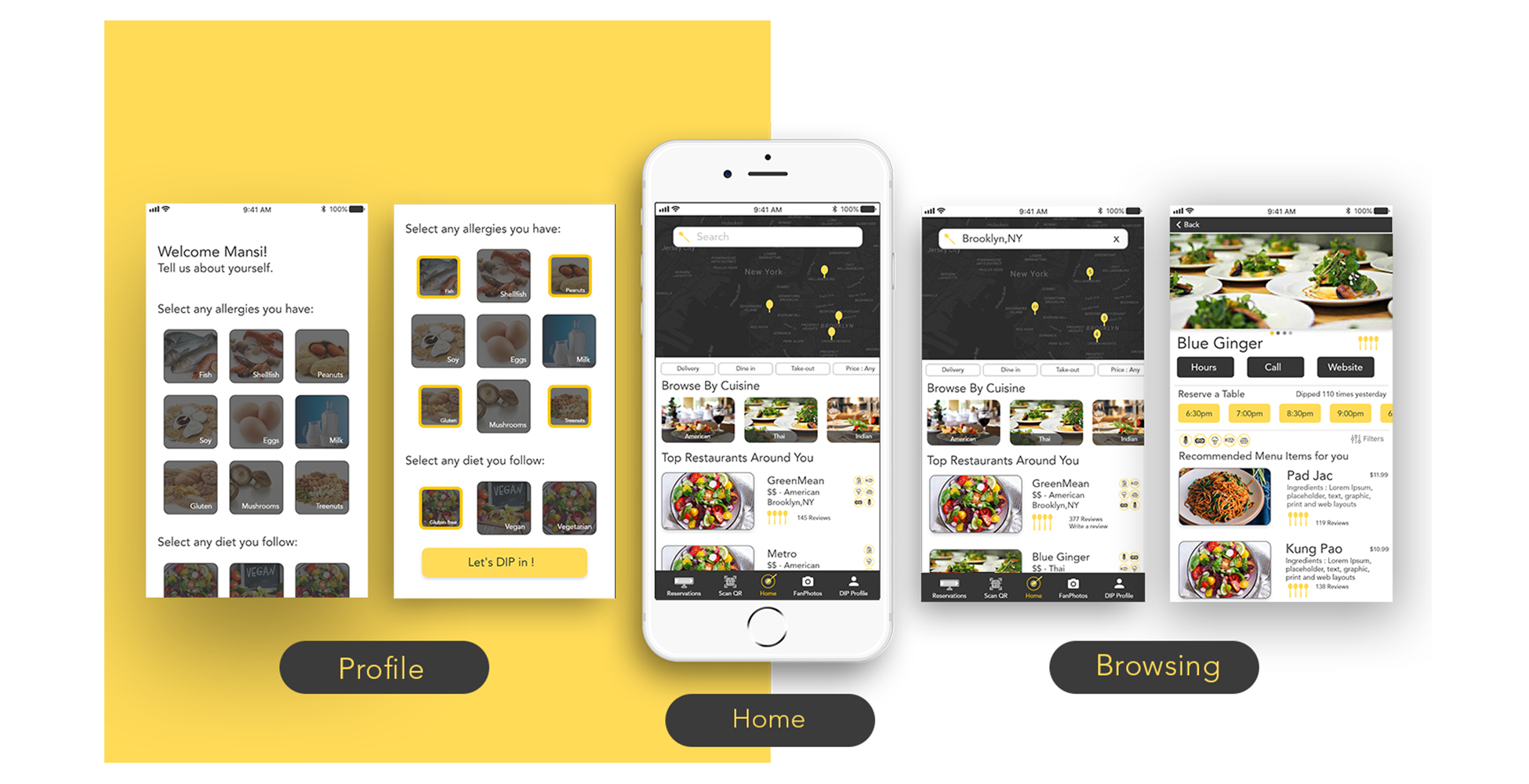
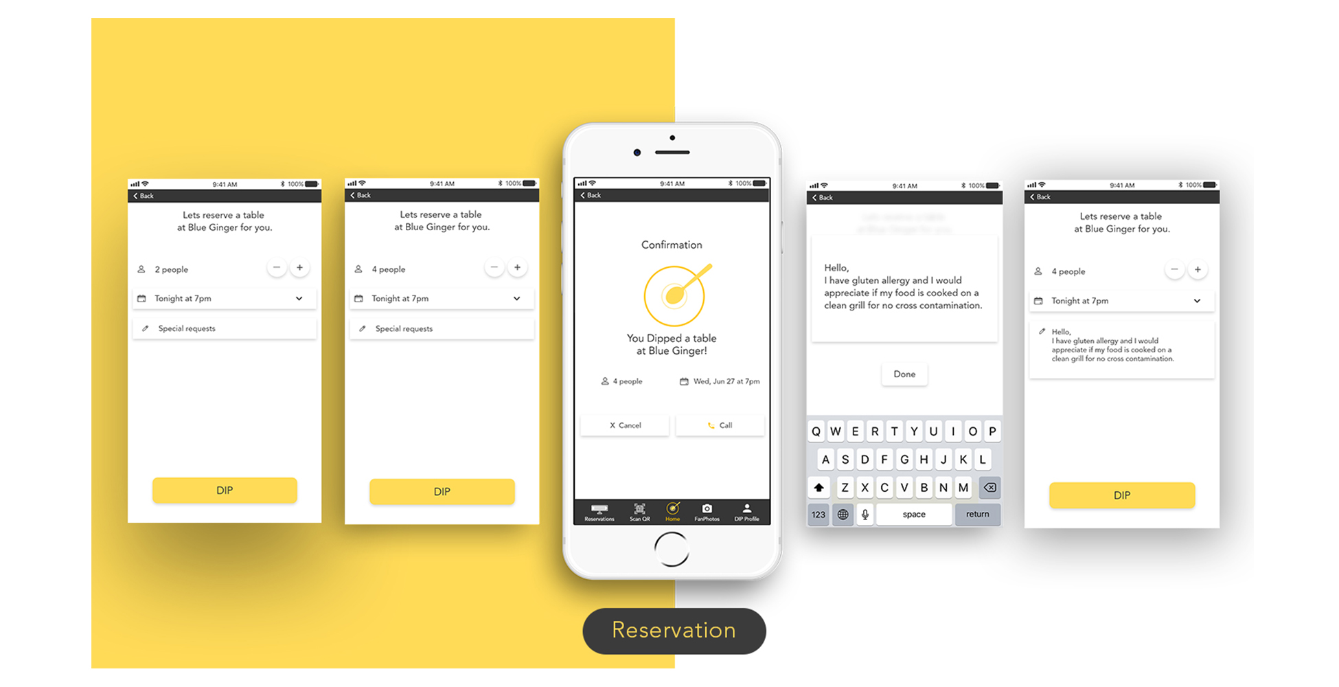
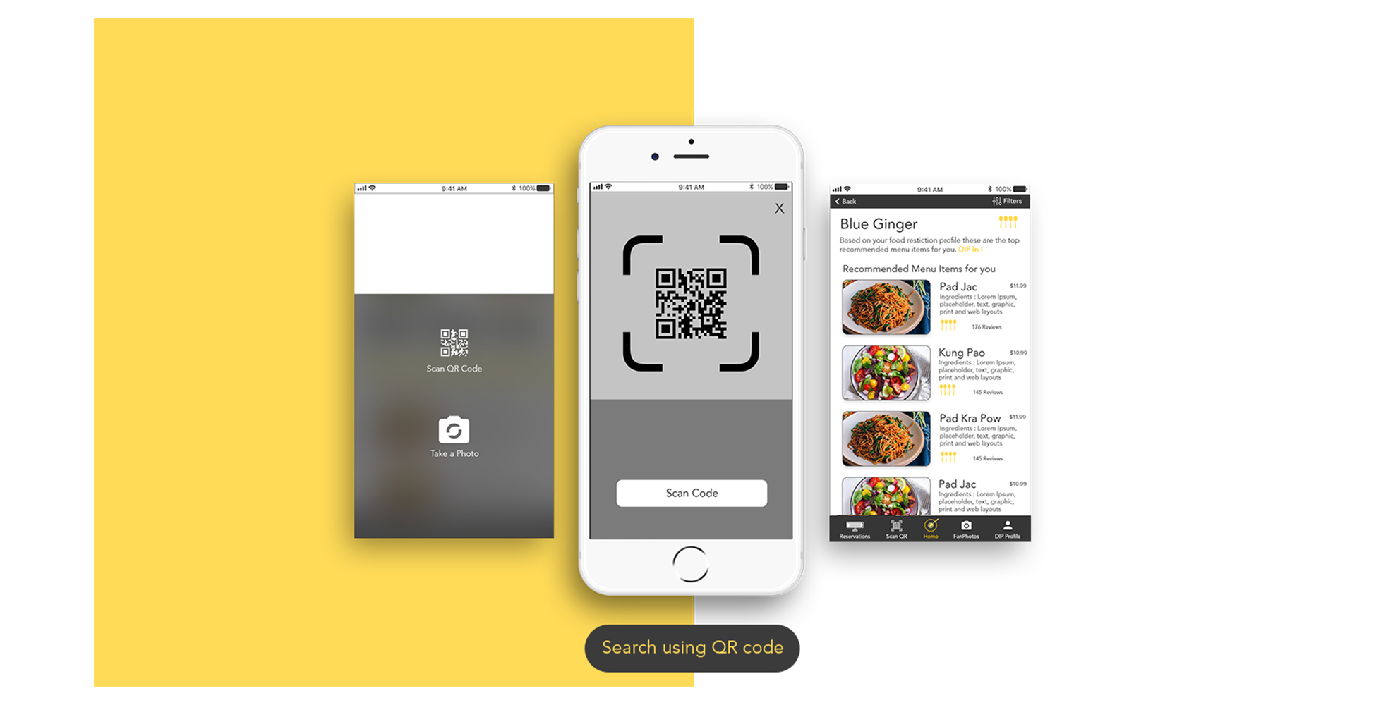
“It was delight to hear that users loved the idea of having a photo feed with delicious meals and little description and reviews for inspiration to dine out.”